Read a dashboard
Someone sent you a link to a dashboard. This guide tells you what you see there and what you can do with it.
The data is saved, not live
Every chart reads a snapshot: a saved copy of query results. When you open a dashboard, the app runs no query — not on your account, not on anyone's. The link is safe to open, and opening it costs nothing.
How old is the data
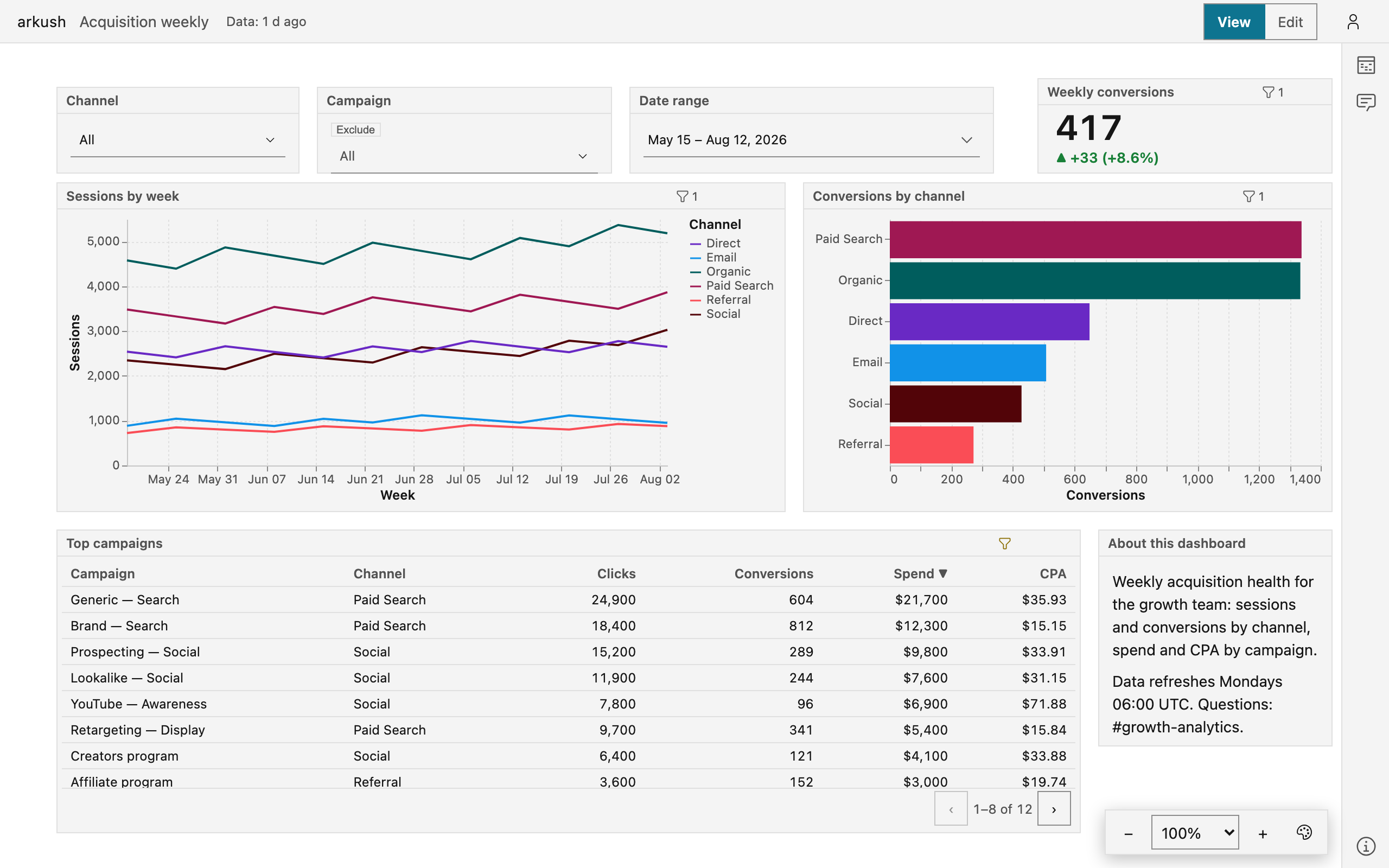
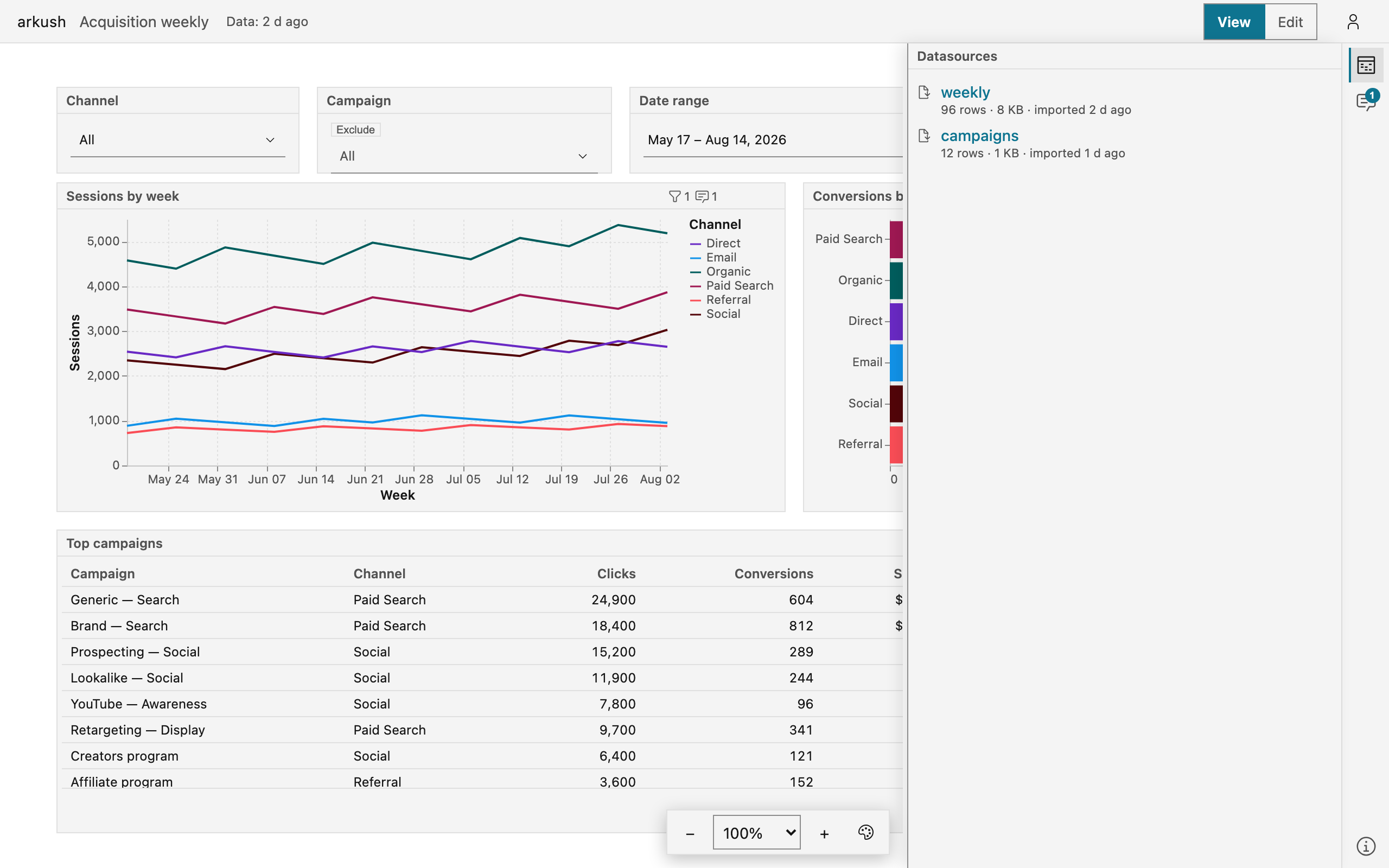
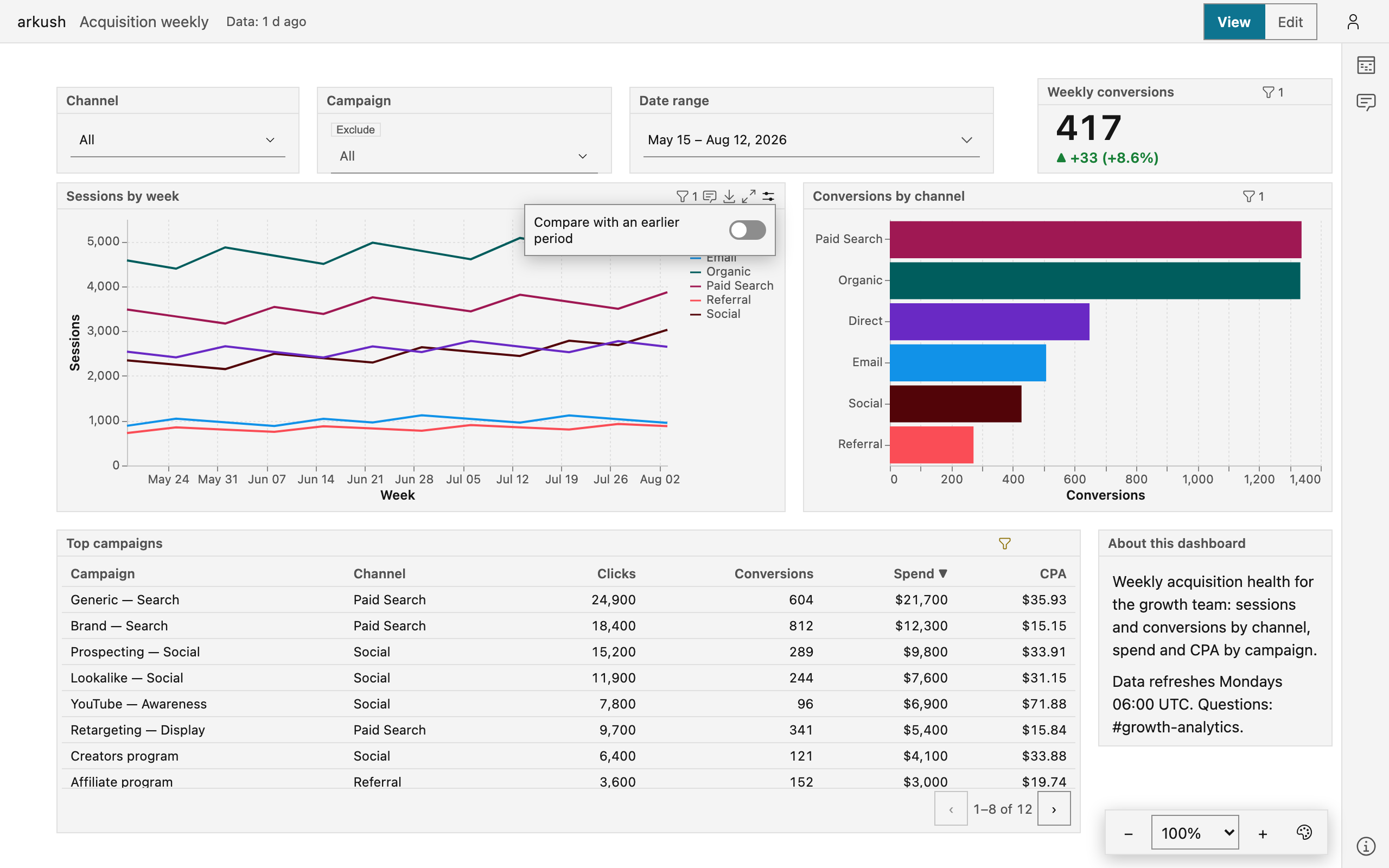
The header shows the freshness chip — "Data: 1 d ago" in the picture above — with the age of the oldest saved data. Select the chip to open the Data panel. The Data panel lists each datasource with its row count, its size, and its refresh date.
Some dashboards refresh on a schedule. The Data panel then also shows the schedule and its next run. When the schedule has fired and the data did not follow, the chip turns amber — the numbers are older than the schedule promises. A dashboard without a schedule never claims staleness: the chip states age only.

How much to trust it
Some dashboards carry a small colored mark beside the title: a pencil for Draft, a blue check for Ready, a green filled check for Official, an amber circled × for Retired. The mark is a claim a named person made about the dashboard. Point at the mark to see the level, who vouched, and when.
A dimmed mark means the dashboard changed after the stamp — its tooltip says so. The numbers can still be right, but the claim is older than the content.

Filters are yours alone
Controls — the drop-down lists, date pickers, and typing boxes on the canvas — change what you see in your browser. They never change the dashboard, and they never run a query. This section covers the essentials. The full story — every operator, cross-filter clicks, and where each filter reaches — is Filter a dashboard.
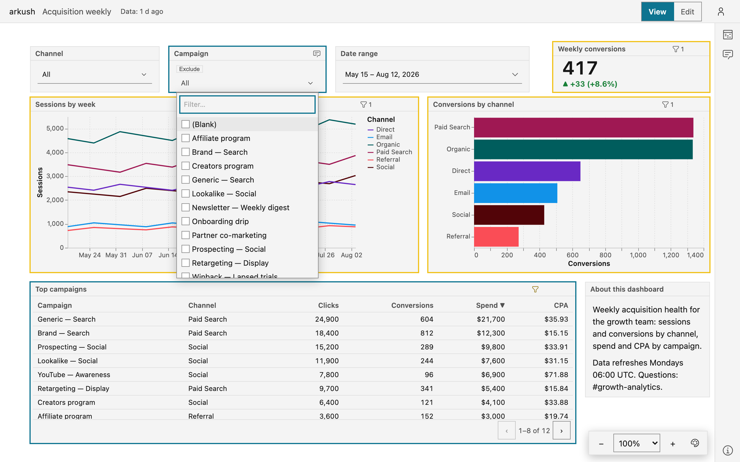
A long list opens with a filter box. Type a few letters to find any value, even one the list does not show at first. Every list leads with a (Blank) row, which finds the rows with no value at all. In a multi-select list the row checks beside the other values, so one selection keeps a value and the blank rows together. A single-select list offers (Not blank) beside it. When the value you need is not listed, type it and select the Use "…" row.
Some list controls carry an Exclude switch beside their label. With Exclude on, the control hides the selected values instead of keeping them. With (Blank) selected, it then keeps only the rows that do have a value. Clear empties the selection. The switch is a selection like any other: it rides the page address and never changes the dashboard.
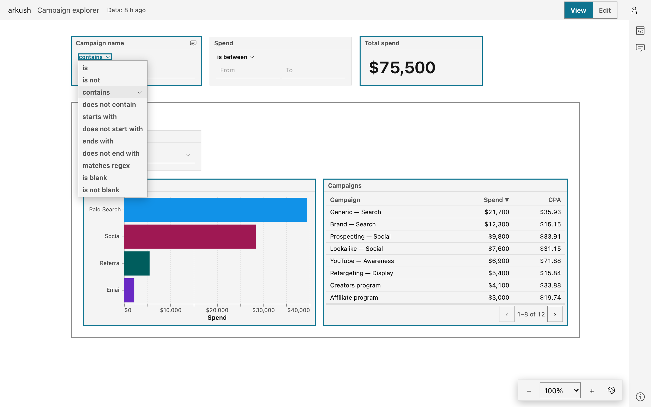
A text or number control shows its test on the label row — "contains", "starts with", "is greater than", "is between", "is blank", and more. Select the test to change it. "is between" filters only after you fill both bounds. An excluding test — "does not contain", "is not" — keeps the rows with a blank value, and the control says so. Clear returns the test to the author's choice.
While a control is open, hovered, or focused, the canvas outlines the blocks its filter reaches. An amber outline marks a block whose data lacks the filtered column — the filter does not apply there.
Your selections become part of the page address. To share your exact filtered view, copy the address. A reload keeps the selections too.
On some blocks, the author lets a click filter the other blocks. Select a bar, a point, or a table cell to filter by its value. Select the same value again to clear the filter.
Read a table
Click a column header to sort by that column — unless the author turned sorting off. Click the header again to reverse the order. A table longer than one page shows a pager under its rows. Sort and page are yours alone, never saved into the dashboard.
A wide table scrolls sideways, and the author can hold the first columns in place while the rest scroll. Scroll over a table to move through its content — the canvas pans once the content ends. A footer row reduces the full data behind the table, not only the page on screen.
Some columns draw their values as links or pictures. A click on a link follows the link — a link column never filters.
A pivot table groups rows into levels. Select the control in a group's row header to open or close that group. Its pager counts row groups, not rows.
Chart options
In view mode, a chart's header carries the Chart options button. It offers the comparison with an earlier period: turn the comparison on or off, or pick another period. The chart redraws for you alone. The dashboard, and what everyone else sees, stay unchanged.
The popover names your adjustment and the dashboard's own setting, with Reset beside the fact. An adjusted chart keeps the button visible, named "Chart options — adjusted". A CSV downloaded from the block then holds the adjusted rows.
The adjustment rides the page address beside your filter selections. Share the address, and the reader sees the chart as you adjusted it. A reload keeps the adjustment. A switch to another dashboard drops it.
Fill the screen with one chart
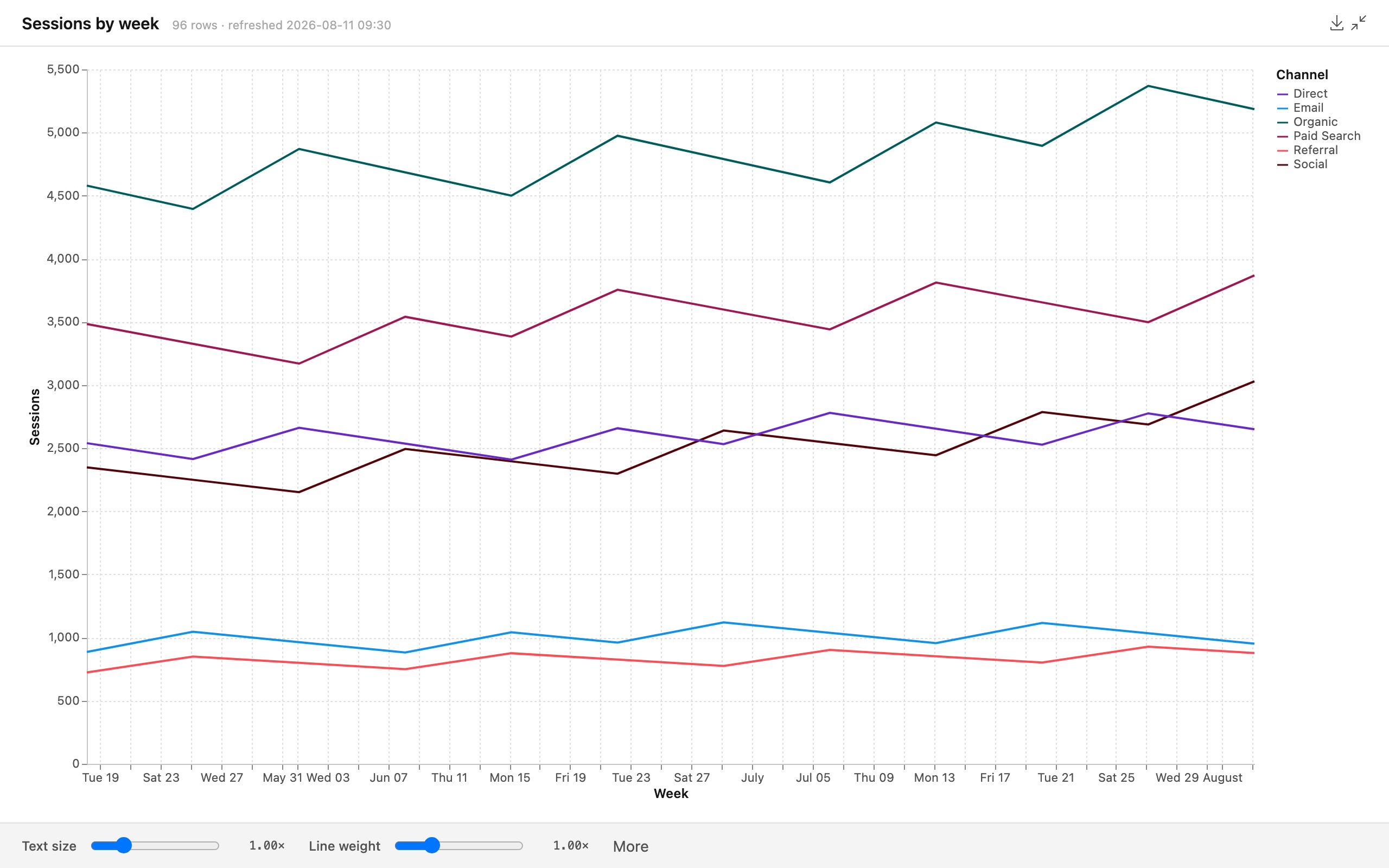
Point at a chart, a table, or a note, and a fullscreen button appears in its header. Select the button and the block fills the screen. Press Escape, or select the same button in the corner, to come back. The fullscreen header restates the block's row count and refresh time, so a screenshot never travels without its date.
A chart drawn for a small block is a different picture at full width: the text is small for the room, the line thin for the width. Sliders under the chart fix exactly that. Text size scales the type. A weight slider takes its name from the mark the chart draws — Line weight on a line, Bar thickness on bars, Point size on points. More holds the rest: Fewer axis labels, Gridlines, and Show every point on a line or an area. Each control appears only when it means something for the chart in front of you — a mark with no weight worth a slider gets no slider.
Select a slider's label to reset that slider. A Reset button appears once anything is adjusted. The adjustments are about your screen and this moment: the app never saves them, they never enter the page address, and each open starts fresh.
A table fills the screen with rows instead — as many as fit — and carries no sliders. A note reads as a page: a centered text column that scrolls. Download while a chart is fullscreen to get the picture at this size — the way to a high-resolution image.
NOTE — On a phone-size screen the app stays in view mode, and fullscreen opens without the adjustment bar.
Take a chart with you
Point at a block and a download button appears in its header. A chart offers three files: Chart as PNG, Chart as SVG, and Data as CSV. Other data blocks offer the CSV alone.
The picture is the chart as you see it — theme, filters, current size — at twice the screen resolution. Choose the SVG to print or to resize: it stays sharp at any size. The CSV holds the rows behind the block, your filters applied, without display formatting. A table's own sort and page do not travel into the CSV — the file is the data, not the screen. The file takes the block's name.
Leave a comment
Anyone who can open the dashboard can comment on it. Point at a block and a comment button appears in its header. Select the comment button to open the Comments panel at that block's thread. The Comments icon in the right rail opens the same panel and carries the count of unresolved comments.
Write in the box at the panel's foot. The comment lands on the selected block, or on the dashboard when no block is selected. Press ⌘/Ctrl+Enter to send it. Your comment carries your signed-in email as its author.
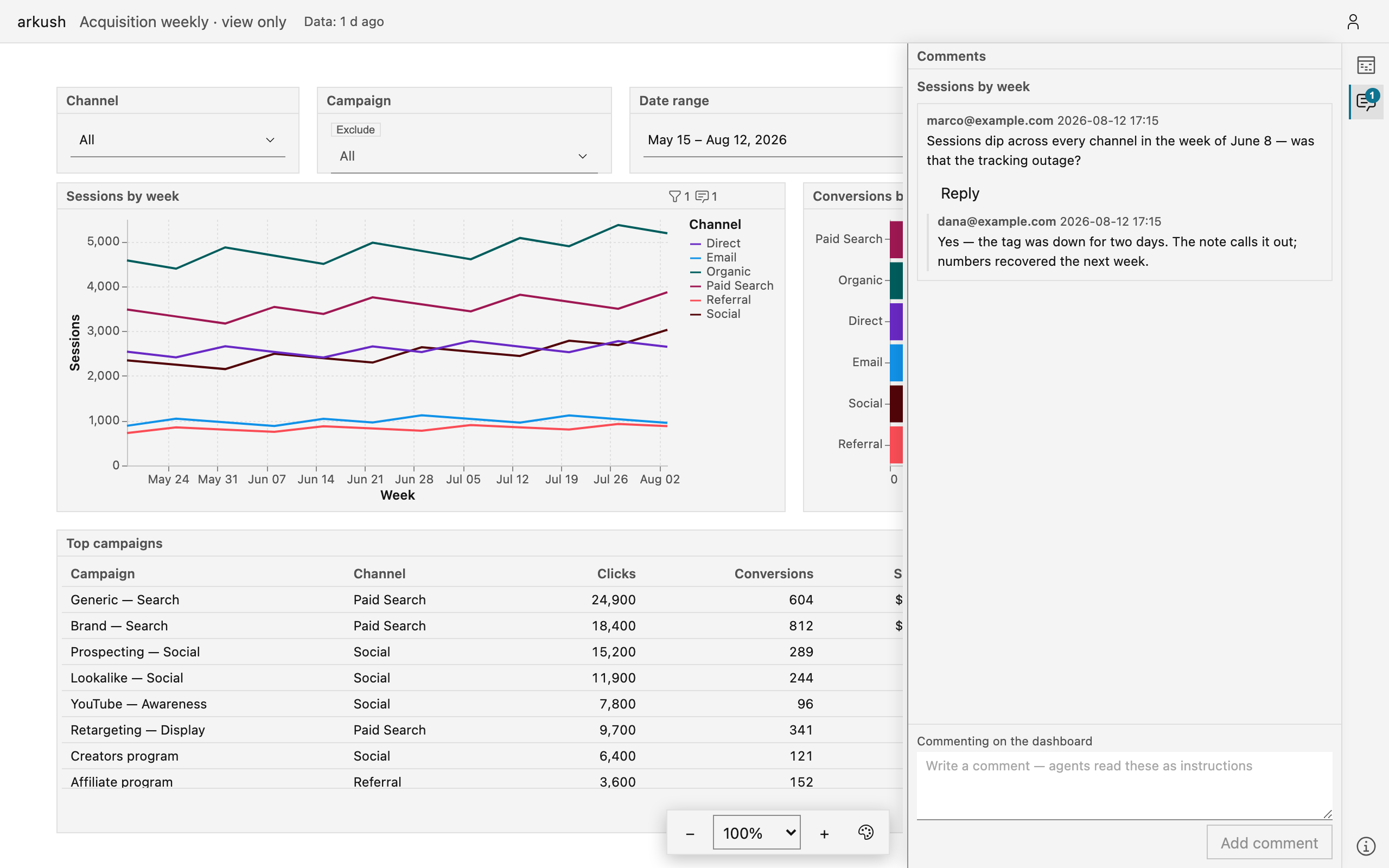
Reply in any thread. Delete your own comments — the app asks first, and deletion has no undo. Only the dashboard's editors resolve threads: a resolved thread means someone acted on the feedback.
Once a block has unresolved comments, its comment button shows their count and stays visible without hover.
Pan and zoom the canvas
The dashboard opens fitted to its width. From there the canvas is free: drag empty canvas or scroll to pan. On a touch screen, drag anywhere — a finger on a chart pans too. Hold ⌘/Ctrl and scroll, or pinch, to zoom. The app never saves your position — the dashboard opens the same way for everyone.
Who can see it
Dashboards are private by default. This one opens for you because its owner shared it:
- with you,
- with a group you belong to,
- or with everyone signed in on this instance.
The link itself grants nothing: a person you forward it to needs the same access.