Filter a dashboard
Every chart on a dashboard reads saved data. A filter slices that saved data in your browser — no query runs, and nothing you filter changes the dashboard. This guide covers the controls on the canvas, the chart click, where each filter reaches, the link that carries your exact view, and — for authors — the defaults behind it all.
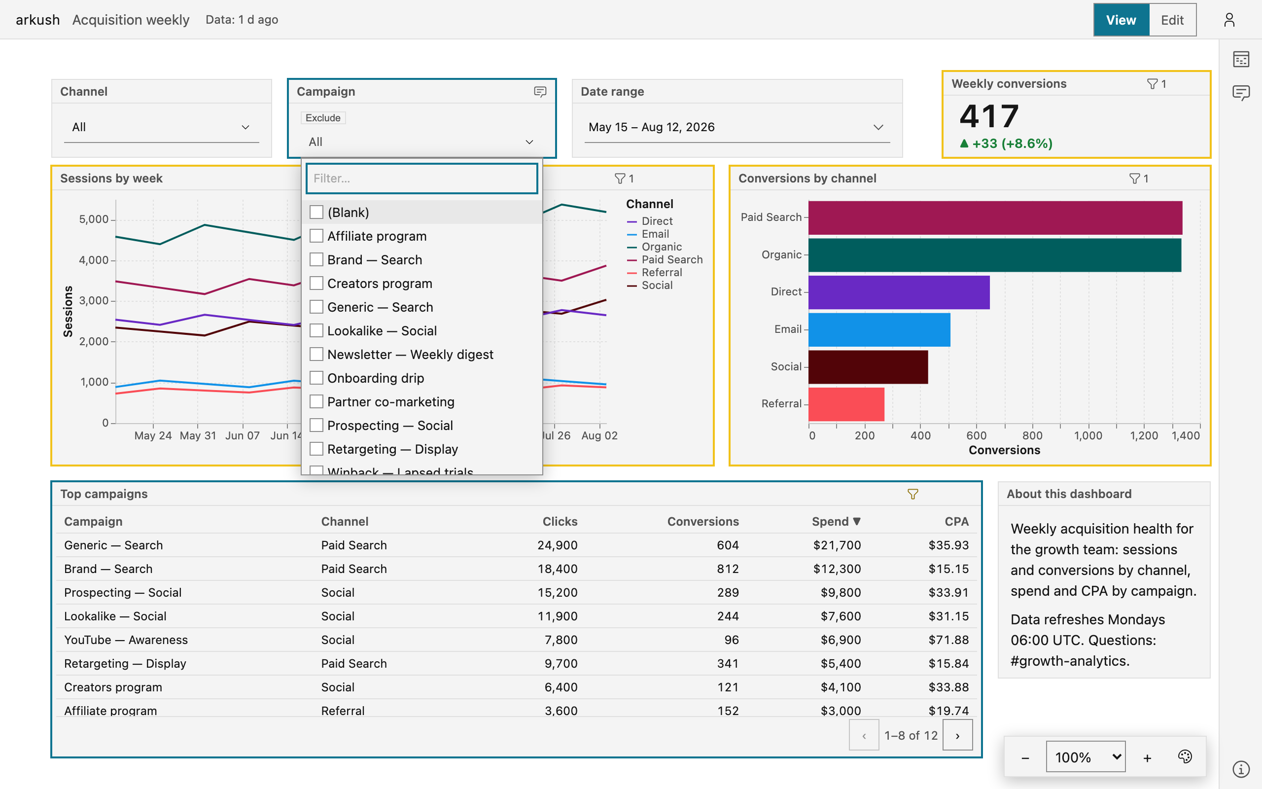
Use a control
Controls are the widgets on the canvas: value lists, date pickers, and typed tests. Each one filters the blocks it reaches, for you alone.
Pick values in a list
A one-value list opens on All — the off state. Pick a value to filter. A many-value list stays open while you check values, and its field shows the count beside the selection.
The filter box searches everything. Type a few letters to narrow the whole value set, not only the rows on screen. The list draws at most 200 matches and says how many more match — type more of the value to reach a rare one. When you type a value the list lacks, a Use "…" row appears at the top. Select that row to commit the typed value.
(Blank) leads every list. It finds the rows with no value in the column. On a many-value list it checks beside the other values, so "North, (Blank)" keeps the named rows and the blank ones together. A one-value list offers (Blank) and (Not blank) as rows of their own.
Some many-value controls carry an Exclude chip beside their label. With Exclude on, the selection drops its values instead of keeping them, and the field reads "not …". An excluding selection keeps the rows with a blank value — check (Blank) to drop them too. While anything is selected, the label row carries Clear.
Pick a period or exact dates
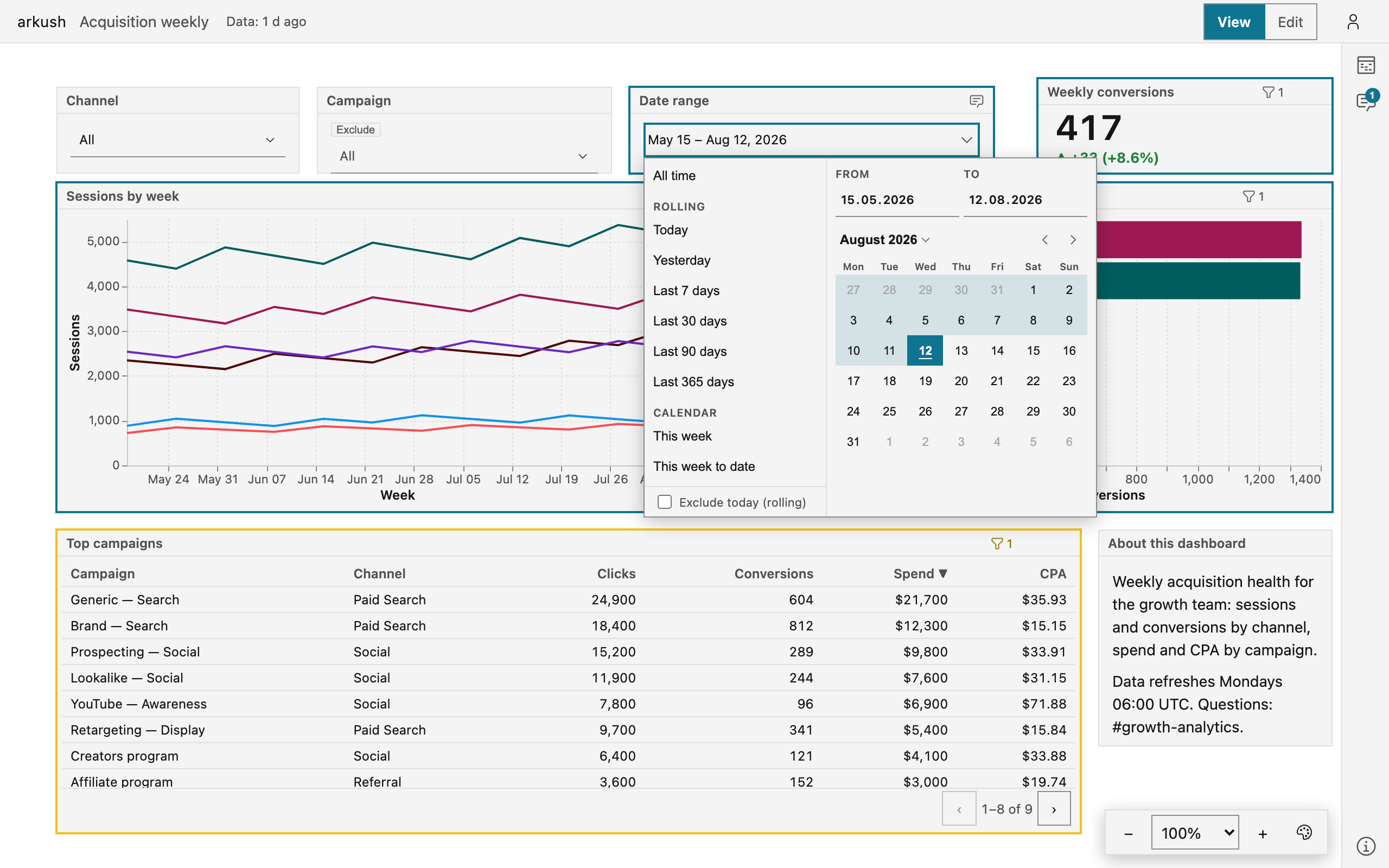
A date-range control is one field plus a popover. The field states the standing range in words: a preset name, a date pair, or All time when nothing filters. The popover holds three ways to say a range:
- Presets — rolling day counts (Last 7 days), calendar periods with their "to date" variants (This month, This month to date), and whole previous periods (Last month).
- Typed From and To bounds.
- A calendar. The first click starts the range, the second commits it, and hover previews the span.
A preset resolves to fixed dates when you pick it, so a link you share holds the exact dates you saw. The Exclude today (rolling) toggle ends rolling ranges yesterday — for a day still in progress.
Type a test
A text or number control is a test. The test sits on the label row, and the value goes in the input beneath. The test menu offers what the column can take — contains and starts with on text, is greater than and is between on numbers, is blank on both.
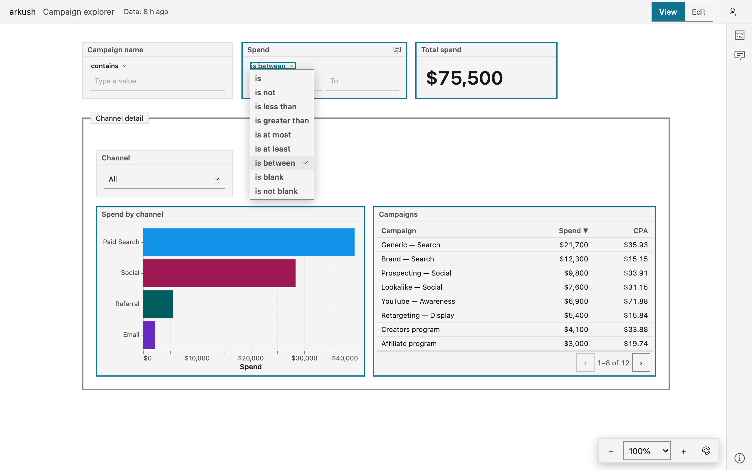
- Select the test on the label row.
- Type the value. is between takes two bounds, and the blank tests take none.
- Press Enter, or click away, to apply.
A half-filled is between filters nothing — the control asks for both bounds. A negated test — does not contain, is not — keeps the rows with a blank value, and the control says so. Clear empties the value and returns the test to the author's default.
Click a chart to filter the rest
On some blocks the author lets a click filter the other blocks — a cross-filter. Before the first click, a click filters by … chip names the gesture (see the badge below).
- Click a bar, a point, a slice, or a table cell. Every block in the filter's reach narrows to that value.
- Click the same value again to clear.
The clicked block does not filter itself — the full chart stays, so the next click can pick a different value. A control bound to the same filter shows the clicked value, and its Clear clears it.
See where a filter reaches
A filter does not always reach every block. Two surfaces answer "what holds where": one on the control, one on each block.
Open a control, or rest the pointer on it, and the canvas outlines the blocks its filter would touch:
- An accent outline — the filter reaches this block.
- A warning outline — the block is in scope, but its data lacks the column. The filter cannot touch it.
- A dashed outline — this chart sets the same filter by click. It filters others, never itself.
Each data block carries a funnel badge in its header with the count of filters that hold on it. Click the badge to open the block's chips — one per filter, each with the value and the outcome:
- A plain "label: value" chip — the filter applies here.
- set by this chart — the block sets this filter by click, so the filter skips it.
- A skipped filter names its reason: no "…" column, not in scope, or ignored by this block.
- this block only — a filter the author fixed on the block itself. No control sets it, and no viewer clears it.
- click filters by … — a click on this chart would filter. Nothing stands yet.
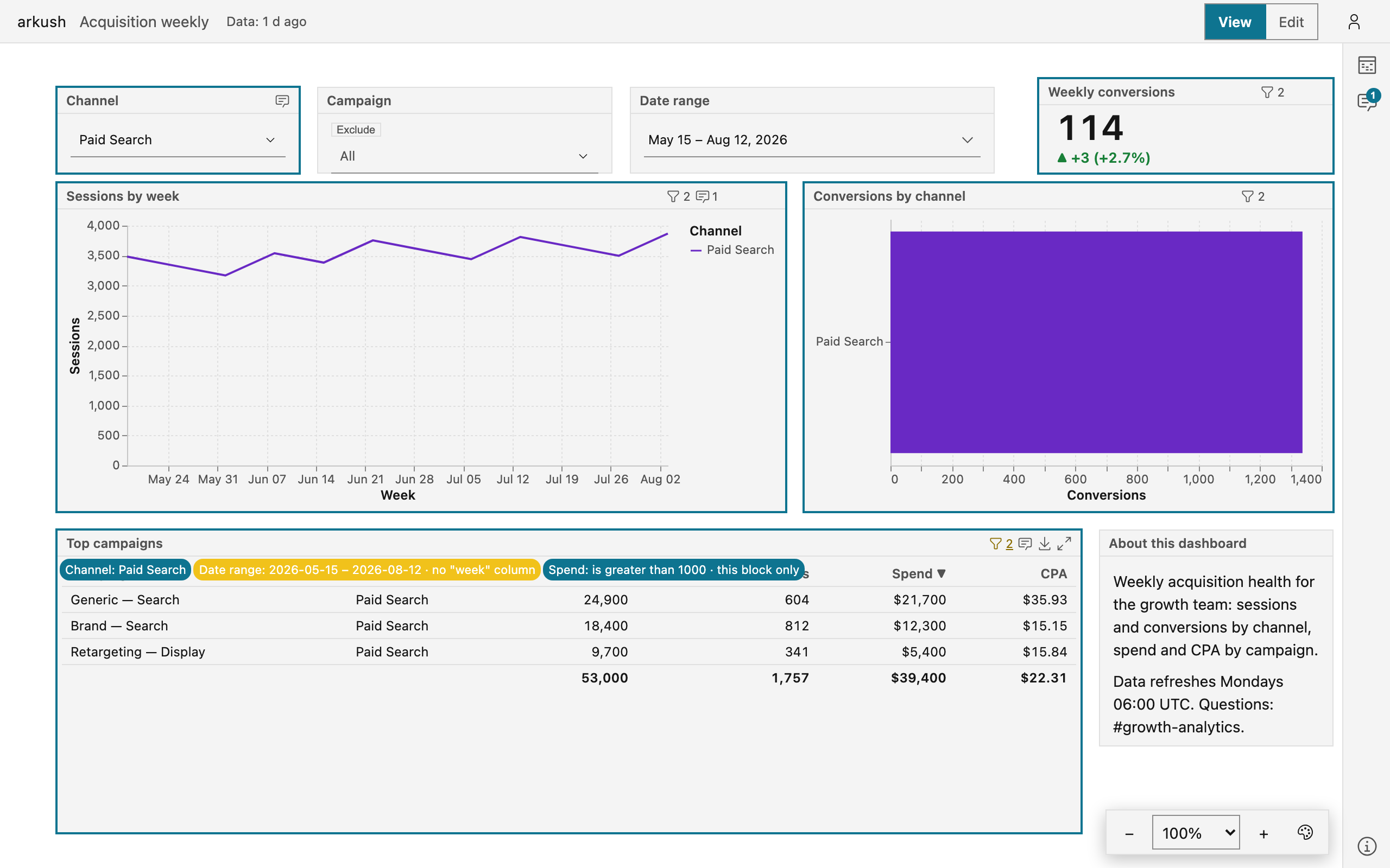
Open chips on several blocks at once to compare what each one answers to.
Share the view
Every live value rides the page address: the selections, the dates, the typed tests, the Exclude mode, and your Chart options adjustments.
- Set the filters.
- Copy the address from the browser bar.
- Send the link. The recipient opens your exact slice.
A reload keeps your values. Opening a different dashboard resets them.
NOTE — The dashboard stores only the defaults the author set. What you filter changes the page address, never the dashboard — nothing changes for anyone else.
For authors: set the defaults
Everything above is the reader's side. Which controls exist, what they open on, and which blocks they reach is dashboard content — the author's to set, in edit mode.
Configure a control
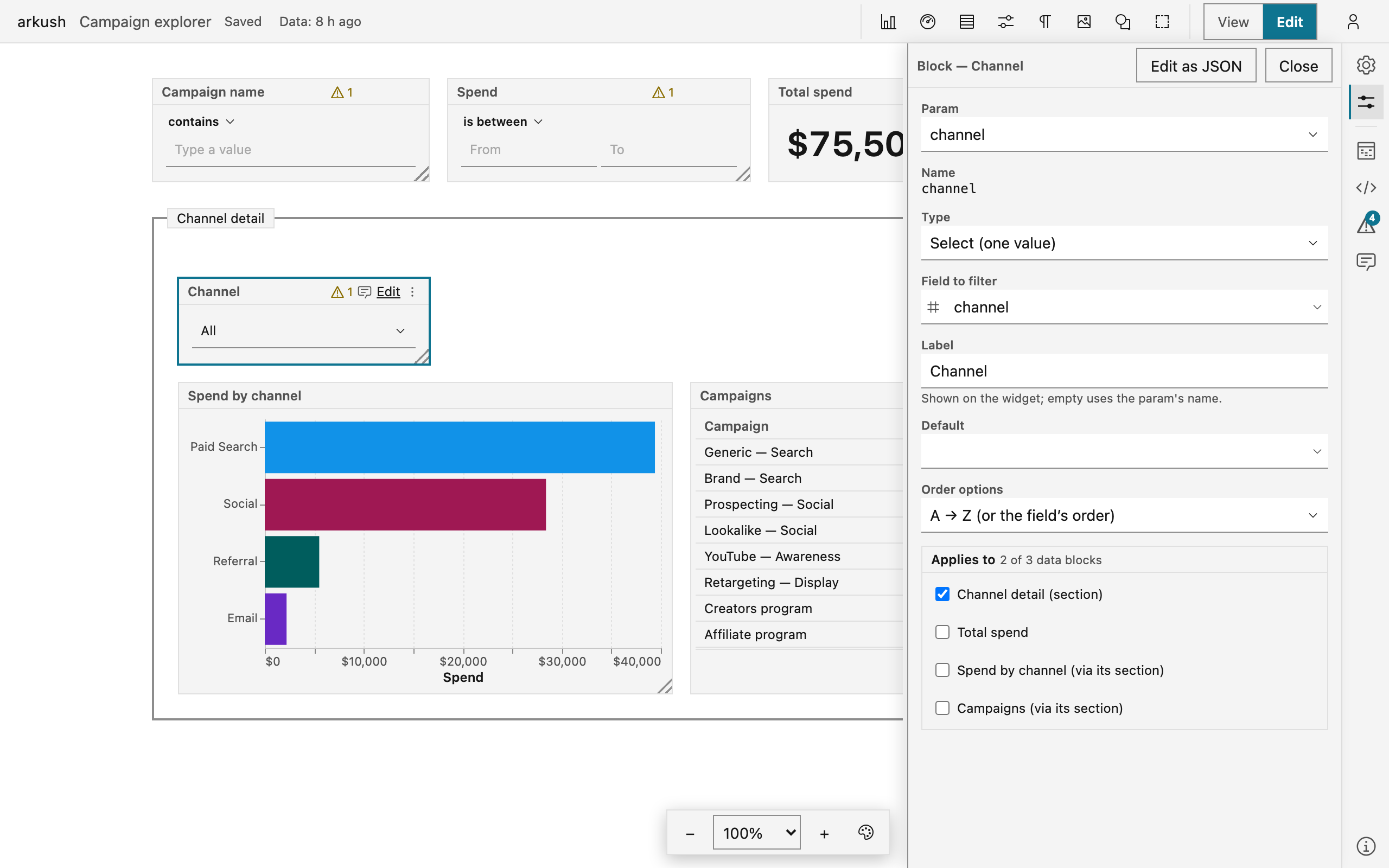
Select a control and choose Edit in its header. The form opens in the Properties panel and applies as you edit — the canvas is the preview.
- Param — the value the control sets. The control is the widget, the param is the value, and one param can drive several controls. Create new param… leads with the column: pick it, and the name and the best-fit type follow.
- Field to filter — the data column, matched by name in every datasource that carries it.
- Type — Select (one value), Multi-select (a set), Date range, Text (type a value), or Number (compare). The picker offers what the field can honestly carry.
- Default — what the dashboard opens on. A list default offers the same (Blank) and Use "…" rows the reader's control offers.
- Test — the authored operator on a text or number param, with Match case on text. A reader can flip it, for their session alone.
- Order options — rank a list's options by a measure. Ranked options draw a bar with the number beside it.
- Exclude selected values — open the control in exclude mode.
- Applies to — the blocks the filter reaches.
Limit a control to a section
Applies to is a checklist of the dashboard's data blocks, all checked by default. Sections list above blocks: check a section, and the filter reaches its member blocks. A block covered through its section reads (via its section). Membership is live — a block dragged into the section joins the filter's reach, and a block dragged out leaves it.
Exempt a block, or fix a filter on it
A chart, scorecard, or table form carries a Filters group — the block's own filtering, apart from any control.
- Ignore dashboard filters exempts the block from every control. The case it exists for: an all-time total beside a date-filtered dashboard.
- Add filter adds a fixed clause the block always applies — a column, an Is / Is not choice, and a value. Match several values turns the value into a set. No widget sets a fixed clause, and no viewer clears one.
Two shapes stay out of the form, and the group says so: an exemption naming individual params, and a date-range clause. Write those in the Source panel, or through the form's Edit as JSON toggle.
Turn on cross-filtering
The form's Cross-filtering group is the one-click path. On a chart it offers the spec's own category dimensions, on a table the shown columns. The switch reuses a param already filtering that column, or creates one named after it. Turn the switch off to remove the block's click rules — the param stays.
Compare with an earlier period
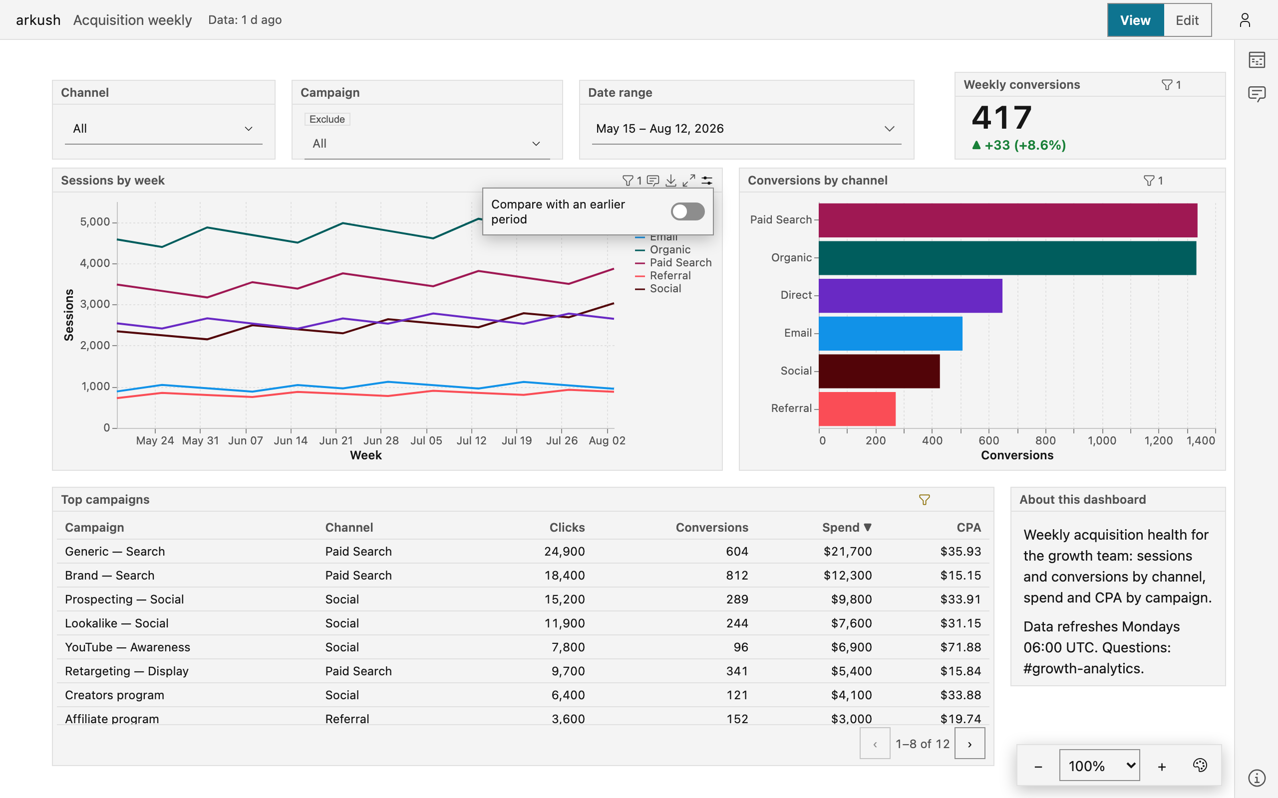
A chart can draw its series twice: the current period, and an earlier one for contrast — dashed on a line, muted on an area, the same color throughout. The author turns the comparison on in the chart's Comparison block. A date-range control that reaches the chart sets the current period, so one date pick moves both periods at once.
You can flip the comparison for your own reading. Point at a chart in view mode and choose Chart options in its header. The popover holds the Compare with an earlier period switch and the mode — Previous period, Previous year, or Custom range. The adjustment rides the link like any filter value, and the dashboard keeps the author's default.
The rest of the reader's toolkit — downloads, fullscreen, data freshness — is in Read a dashboard.