Build on the canvas
A connected assistant is the fastest way to build a dashboard — that path is the Connect an AI agent guide. This guide is the manual path: what you can do with a click or a form, and where the forms end and JSON begins.
Everything on the canvas is one JSON document. The canvas and the Source panel are two faces of it: a block you drag moves in the JSON, and JSON you apply moves on the canvas.
Before you start
Open a dashboard you can edit and set the header's mode switch to Edit. A phone-size window stays in view mode — to edit, use a desktop or tablet window.
Start on the empty canvas
An empty dashboard shows a short walk under the title Start your dashboard:
- Upload a file — opens the file picker and imports the picked file. This step leads while the dashboard has no data.
- Make a chart — inserts a chart block. The step waits until some datasource has rows, because a chart needs something to show.
- Connect an AI agent — opens the connection panel.
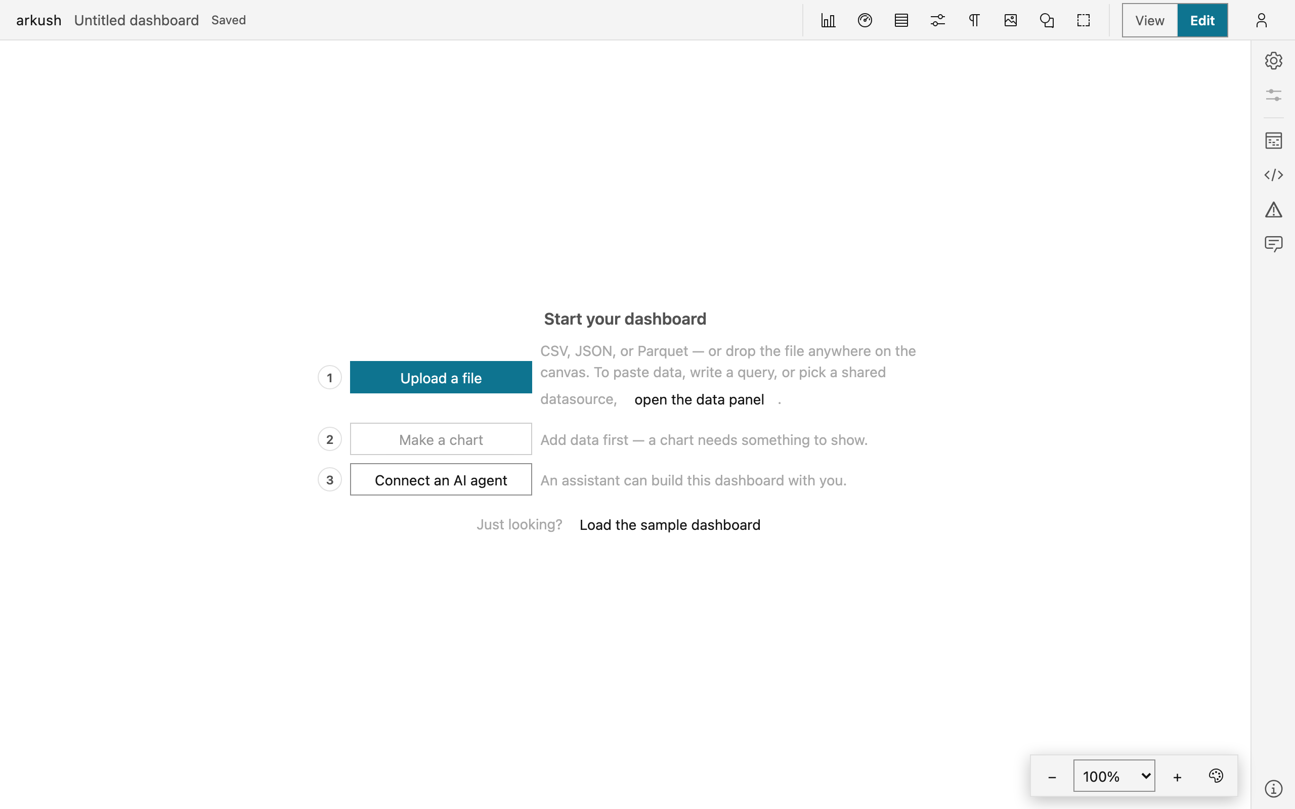
The fastest start is a data file. Drop a CSV, Excel, JSON, or Parquet file anywhere on the canvas. The file becomes a datasource, and a table block bound to it lands where you dropped it — one undo step for both. Every other way to data — paste, a query, a Google Sheet — is the Bring data in guide.
Add a block
In edit mode the header carries the block palette: one button per block type. Click one, and the block lands at the center of the view, selected, with its editor open.

- Chart — one chart drawn from a datasource's saved rows.
- Scorecard — one number: a column reduced over the rows, with an optional delta and sparkline.
- Table — the rows themselves, paginated, with format rules.
- Sankey — a flow diagram over two columns: where something came from and where it went, drawn as stages with ribbons between them.
- Control — a filter widget bound to a param, the dashboard's named filter value.
- Note — markdown text.
- Image — a picture from a web address.
- Shape — a drawn rectangle or ellipse with a label, for annotation.
- Section — a titled region that carries the blocks inside it.
- Connector — a line between two blocks. Connectors are not in the palette: author them in the Source panel, or ask an agent.
A composite chart — facets, repeats, side-by-side views — is JSON-first: paste its spec into a chart's spec editor, and the block retypes itself.
NOTE — Block forms apply instantly. The live block on the canvas is the preview, and each change is one undo step.
Shape a chart where it stands
Select a chart, and small blocks appear pinned around the canvas edges: the mark and the position channels along the top — the other channels, the decorations, Tooltip, Comparison, and Code down the left. Each block states its binding on its face and opens one popover with that binding's controls.
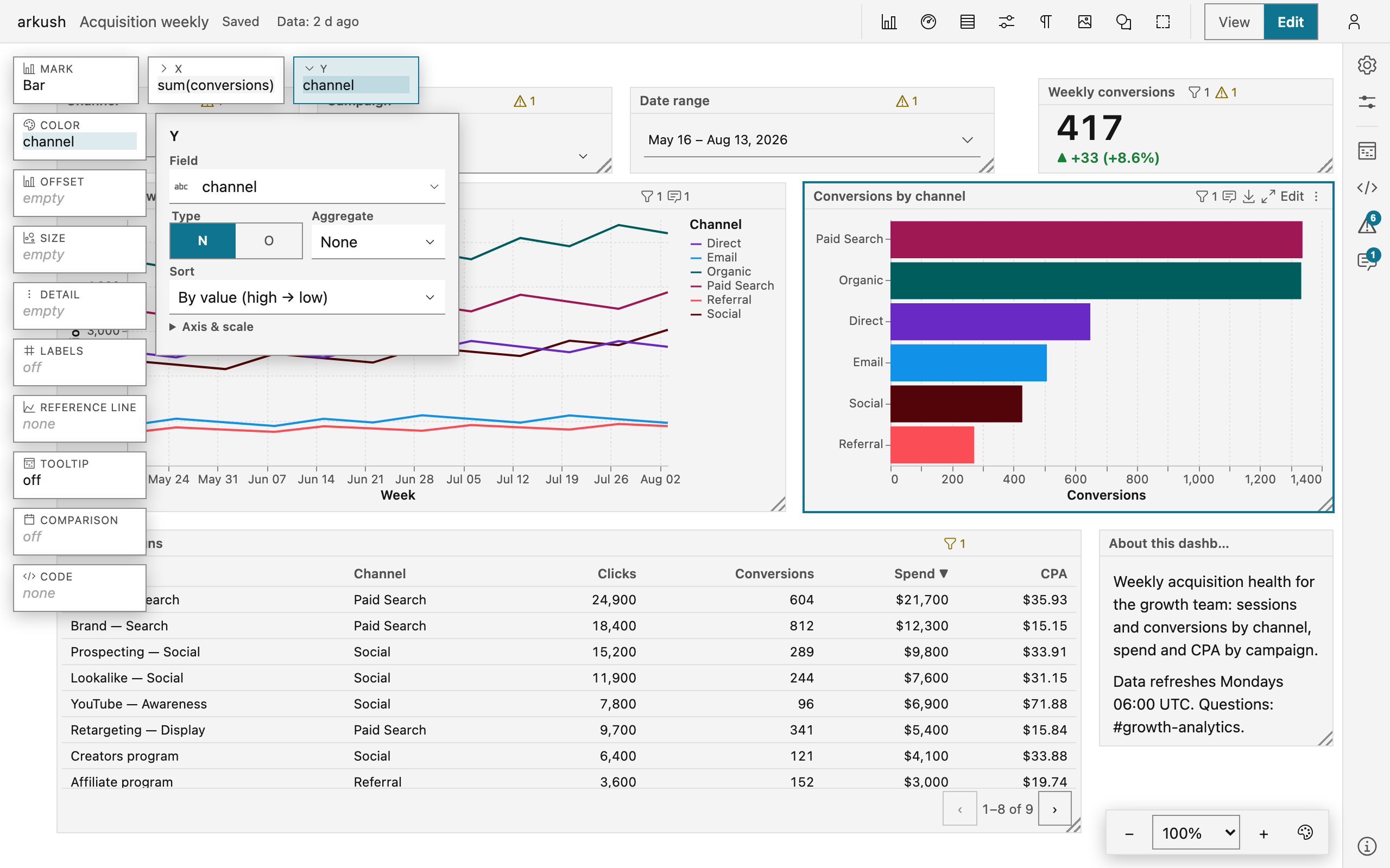
- If the chart is blank, pick a chart type from the grid in its body. The grid groups its templates by intent: Compare amounts, Change over time, Part-to-whole, Relationship, Distribution.
- Open a channel block — X, Y, Color — and pick a field. The popover also holds the field type, the aggregate, and, per type, bin or time unit. On a number, one click on sum or avg binds field and aggregate together.
- To bind by drag, drag a field from the Data panel's Fields list onto a channel block.
- Open the Mark block to change the mark and its knobs.
- Sort a category axis inside that channel's popover.
- Turn on Labels to print each mark's value.
- Add a reference line from the Reference line block — Add line draws the measure's average, and each line edits to a fixed value or a stat.
- Set the tooltip in the Tooltip block: Off, Chart fields, or a custom field list.
- To draw the series over an earlier period too, open the Comparison block and turn on Compare periods.
The Code block names what the spec holds beyond these controls — transforms, selections, extra channels — and opens the spec editor, so nothing JSON-only is invisible. A hand-layered spec beyond labels and reference lines closes the blocks: edit it as JSON. The Properties panel keeps what is not encoding: the datasource, Filters, and Cross-filtering.
Make a scorecard
A scorecard is authored on the canvas like a chart: select one, and its own blocks appear — Value along the top; Comparison, Sparkline, and Code down the left.
- Add a scorecard from the palette. If the dashboard has several datasources, pick one in the Properties panel.
- Pick the field in the tile's own body — measures lead the list.
- Open the Value block to change the field, the reducer (Summarize by — sum, mean, min, max, count, last, or first), the number format, and where the status color shows.
- In the Comparison block, turn on Compare for a delta line: against an earlier period of a date column, a target number, or a second column.
- In the Sparkline block, turn on Show trend and pick the column under Trend over. On a date column, set Granularity — Auto, or a calendar unit from day to year. Pick the Style: Line, Bars, or Area.
When the number is a ratio — revenue per order, a conversion rate — define a measure on the datasource and pick it: measures lead the Field picker, and the reducer stands down because the formula carries its own. The number's label and format come from the field's own metadata, with an override in the Value block's Number format row. The Properties panel keeps the datasource and the Filters group.
Make a table
- Add a table from the palette. A fresh table shows every column of its datasource.
- In the form's column list, hide, reorder, and configure each column: alignment, format, what the cell shows, a footer reducer.
- To set a column's width, drag the right edge of its header. Double-click the edge to make the width automatic again. Columns without a set width share the remaining space.
-
To turn a column's values into links or pictures, set its cell to a link or picture cell.
The Address field takes a template whose
{column}placeholders read that row's values — left empty, the cell's own value is the address. - Add format rules in the Format section. Add rule paints the cells — or whole rows — that match a condition. Add scale grades a numeric column on a color scale. Each new rule arrives complete and paints at once.
- Turn on the Pivot group for a crosstab: row fields down the left, up to two column fields across the top, values each with its own reducer, and three totals switches.
The form also holds the sort, the page size, Wrap long text, and Keep first columns in place.
Arrange the canvas
- Move — drag a block by its header. Positions snap to the document's grid.
- Align — while you drag, the block's edges and centers snap to other blocks' within 8 screen px, and a thin guideline marks each match. Exact alignment beats the grid.
- Resize — drag the bottom-right corner handle.
- Select several — Shift+click adds a block, Shift+drag on empty canvas sweeps a selection rectangle, and ⌘/Ctrl A selects every block. A drag on any selected header moves the whole set as one undo step.
- Nudge — arrow keys move the selection one grid step, Shift+arrows five.
- Duplicate and delete — ⌘/Ctrl D duplicates, the Delete key deletes, and both also sit in the block's ⋯ menu. A delete asks nothing — a notice names the block and the undo key.
- Paint order — where blocks overlap, Bring to front and Send to back in the ⋯ menu reorder them.
- Sections — a section's title chip is its handle: drag it and the section's blocks move along. Drag a block in or out to change membership. The body is click-through — only the chip or the border selects the section. A control can scope itself to a section, and then filters the section's data blocks.
- Connectors — a connector points from one block to another and follows them as they move. Click its line to select it, Delete to remove it. Author a new connector in the Source panel.
Undo and redo
⌘/Ctrl Z undoes, ⌘/Ctrl ⇧ Z redoes. One gesture is one step: a whole drag, a whole text edit, a burst of nudges. When a teammate or an agent edits the same dashboard, your undo never reverts their work — a step their edit overwrote is skipped, and a notice says so. Inside a text field the keys stay the field's own undo.
Write and decorate
Notes
Double-click a note's body — or select it and press Enter — and write. The text is markdown:
headings, lists, tables, quotes, code, links, and pictures via
. Changes commit as you type, and Escape exits with the
text kept. What the renderer does not draw stays literal text.
Images
An image block without an address shows its own form: paste the address into Image URL and select Set image. A picture that fails to load returns to the form with the address kept and the error named.
Block titles
Double-click a title — or press F2 — to rename a block. A blank title falls back to the block's id. A chart's form adds the Title choice: in the header, drawn on the chart itself, or hidden. Other block types hide a title through the Source panel only.
Edit the JSON where the form ends
Open the Source panel from the right icon rail, or press ⌘/Ctrl J. It shows the whole dashboard as JSON and follows the canvas live until you type. Typed edits buffer until Apply, which validates first — invalid JSON or a broken document shows the error and changes nothing. Revert discards the buffer.
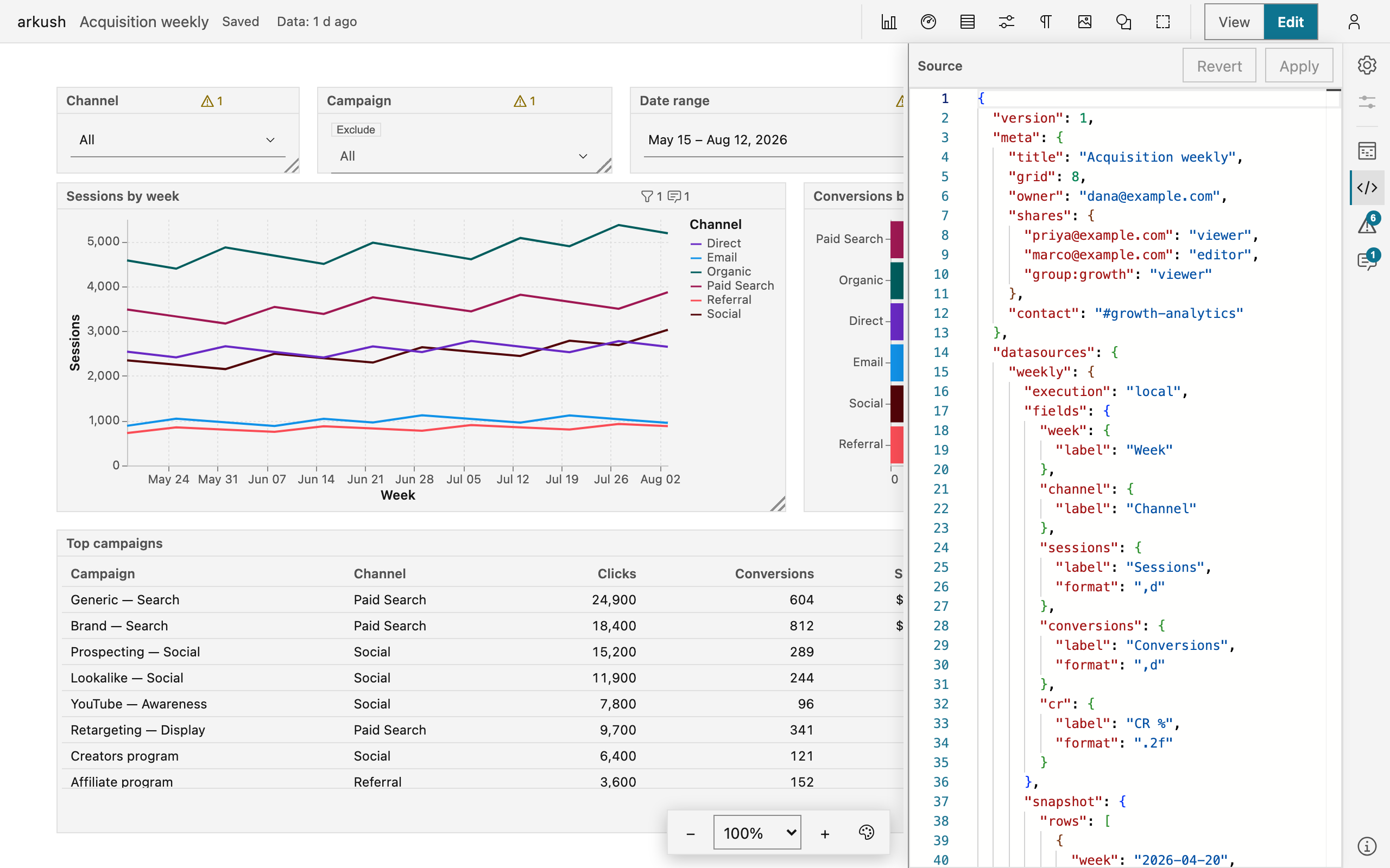
For one block, every typed form carries Edit as JSON — the same block as raw JSON, with the same Apply contract. Composite chart, note, image, shape, section, and connector blocks have no form: their Edit action opens the block's JSON directly.
A chart's spec editor works differently: the chart redraws on the canvas as you type, a moment after you stop, so you can shape a spec while watching it. Apply is still what saves — until you press it, nothing reaches the dashboard, and Revert or Close throws the draft away. While the JSON is half-typed, the chart holds its last good version, dimmed, with the problem written over it. The chart's authoring blocks step aside while you are in the text, and come back when you apply, revert, or close.
The editor knows Vega-Lite: it completes property names and values from the schema, and where the spec names a column it completes the chart datasource's own columns, each labelled with its field type.
Some things only the JSON reaches: a chart spec layered by hand, selections and custom transforms, composite charts, connectors, a field's thresholds and value mappings, and the deep knobs each form names as JSON-only. The in-app Help panel keeps the current inventory.
The Source panel edits the same document an agent edits over MCP — the two paths are equal, and nothing on the canvas lives outside it. When hand edits become slow, connect an agent and describe the change instead.