Theme a dashboard
A dashboard can carry one named look: its chart colors, its fonts, and the canvas around the charts. The look lives inside the dashboard, so everyone who opens it sees the same thing. This guide shows where the look lives and how to change it.
Your light and dark mode
The account menu at the top right holds a mode switch: Switch to dark mode, or Switch to light mode when you are in dark. The switch restyles the app around the canvas, and dashboards that carry no theme of their own. It follows your computer's setting until you use it, and nothing is saved — a reload starts from the computer's setting again.
The mode is your preference, not the dashboard's. A dashboard with a theme keeps its own look in either mode.
Give the dashboard a look
- Open the dashboard.
- Select Edit in the header.
- On the right rail, select Dashboard settings (the gear icon).
- Under Theme, select Edit theme.
- Pick a look from the Theme list, or select Customize current look to start from what you see.
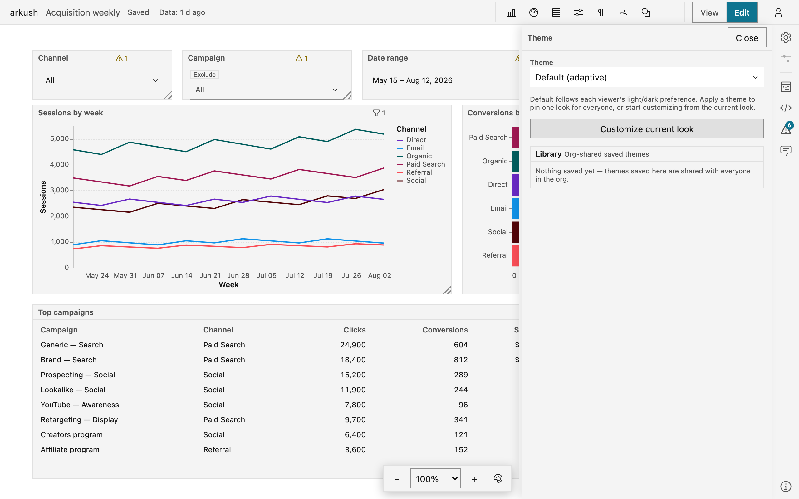
Every change applies to the open dashboard at once — the dashboard is the preview. Theme edits are dashboard edits: they save with the dashboard, and undo takes them back.
The editor groups what a theme covers:
- Colors — the chart palettes: the categorical palette, the sequential and diverging ramps, and the status colors.
- Charts — the chart font, the grid lines, and the text colors.
- Dashboard — the canvas and the blocks: canvas background, block background, block borders, corner radius, and the block titles.
- Edit as JSON — the whole theme as JSON, for options the controls do not cover.
- Fonts — the instance fonts (analysts only, at the panel's end): upload a WOFF2, TTF, or OTF file, and its family joins the font options for every editor on this instance.
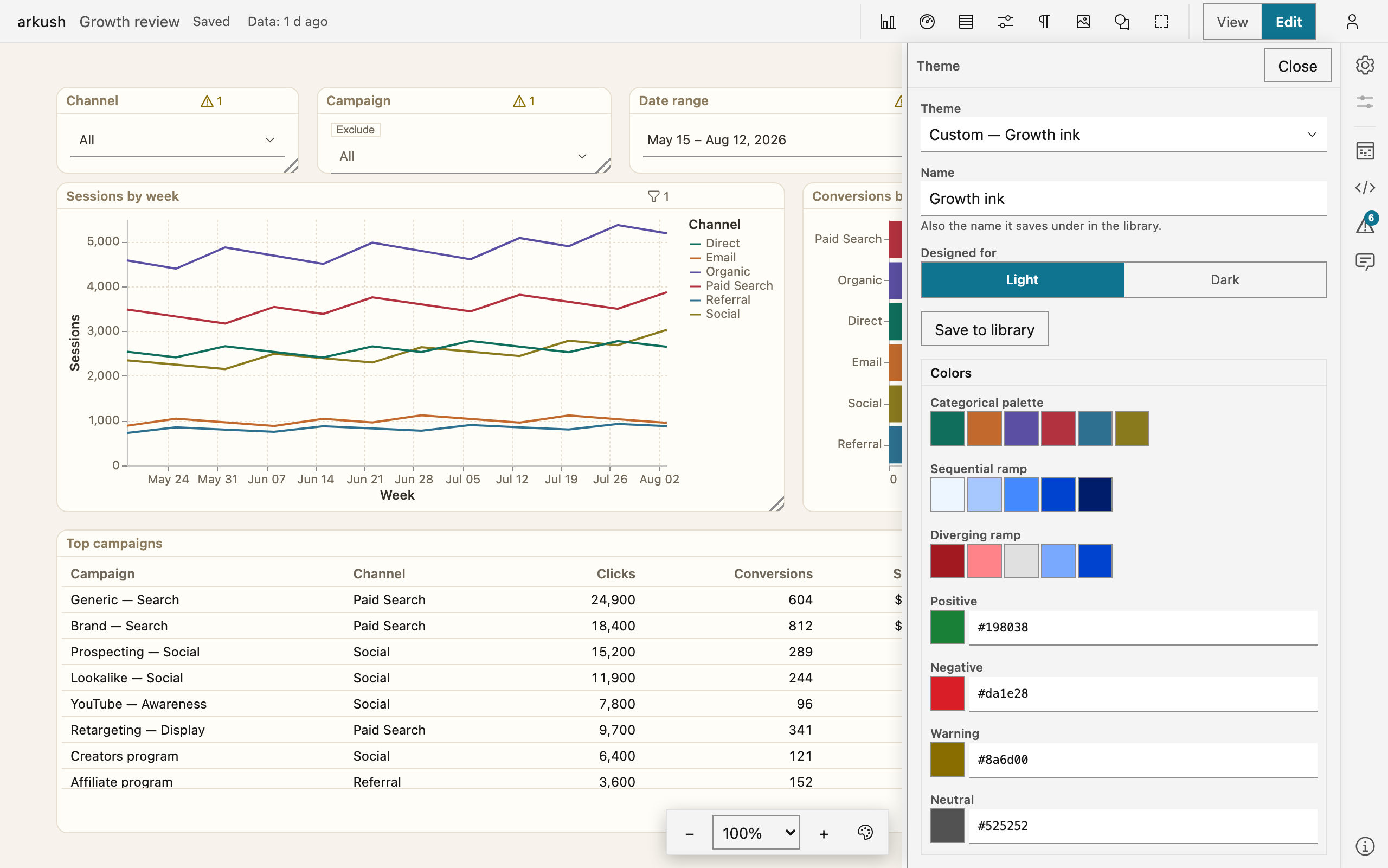
Every color accepts transparency. A fully transparent block background, with block borders off, is the frameless look: charts sit directly on the canvas, with no sheet behind them.
Name the look in the Name field, and set Designed for to the mode the colors are chosen for. A themed dashboard keeps that look in both app modes — your mode switch changes the app around it, never the canvas. When the theme's mode differs from your app mode, the editor shows a note and offers the mode switch. For an unedited built-in theme, the note also offers the sibling designed for your mode. The app never switches modes on its own.
When you edit an applied theme, the Theme list reads Custom — the dashboard's own edited copy. If you then pick another theme, the editor asks before it replaces your edits. Pick Default (adaptive) to remove the theme — the dashboard follows each viewer's mode again.
Use a saved theme
The editor's Library section lists the themes saved for your whole organization, each with its name, its mode, and who saved it. Select Apply to use one. The dashboard gets its own copy: a later change in the library never reaches a dashboard that already applied the theme. To pick up the change, apply the theme again.
Saving into the library is curation and needs the analyst right. With that right, the editor shows Save to library, and the theme saves under its name. When the library already holds that name, the button becomes Update “…” in library and updates that entry.
A new dashboard does not start bare: it carries the default theme for your mode. Out of the box that is the built-in look — Paper in light, Night ink in dark. An admin can set a different default for each mode, from the saved themes or the built-ins, on the admin page.
View the dashboard in another look
Viewers see the dashboard exactly as you designed it — the theme travels inside the dashboard, with no extra setup. What anyone can change is their own view of it:
- At the bottom of the canvas, select the palette icon beside the zoom control.
- Select a look: As designed, Match my light/dark mode, a built-in theme, or a saved theme.
- To go back, select As designed.
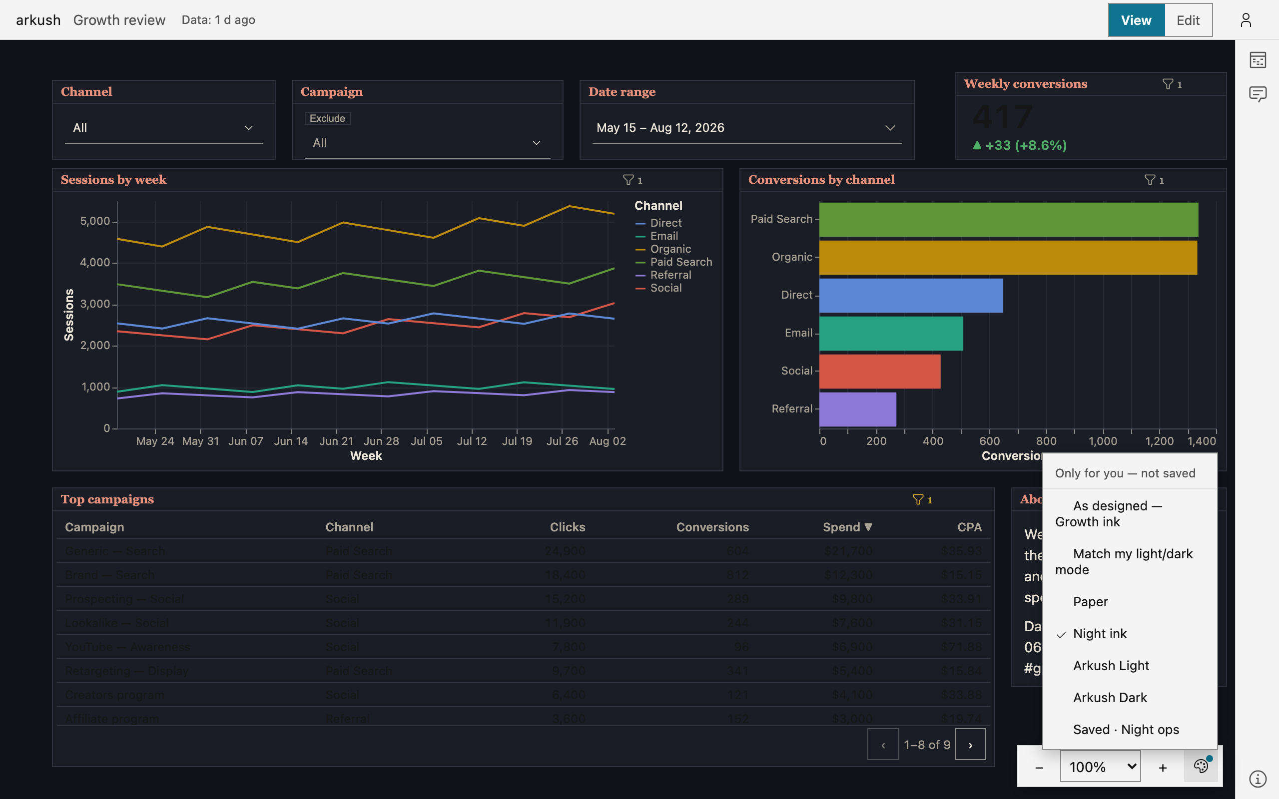
The menu's header says it plainly: Only for you — not saved. The choice never touches the dashboard, no one else sees it, and it resets when you open another dashboard. While another look is on, a dot marks the palette icon. The menu works in view mode too — it is the one theme control that needs no edit access.
On a dashboard without a theme, Match my light/dark mode is absent — that dashboard already follows your mode. When you open the theme editor, the choice clears: the editor always shows the dashboard's real theme.
Agents and the theme
NOTE — A connected agent can change the look: the theme is part of the dashboard, and an agent reads and edits it like any other content. An agent cannot save themes into the org library — that stays an act done in the app.